Views: 0 Author: Site Editor Publish Time: 2025-07-15 Origin: Site


Color is more than decoration. In educational environments, color psychology directly influences attention, memory, mood, and even behavioral regulation. Selecting the ideal colors for school furniture requires an evidence-driven balance between aesthetics, developmental psychology, and practical durability. Done well, a purposeful color palette can uplift student morale, reinforce instructional objectives, and communicate brand identity for the institution.

This guide provides a deep dive into how strategic color choices transform classrooms, libraries, cafeterias, and specialized labs. Four core sections explore:
1. Color Psychology Foundations—how hues affect cognition and emotion.
2. Age-Specific Color Strategies—tailoring palettes from early childhood to high school.
3. Space-Based Implementation—matching colors to the functional demands of different rooms.
4. Material & Maintenance Considerations—ensuring vibrant finishes stand the test of time.
Along the way, you will find practical tables, real-world case studies, and actionable tips to help designers, administrators, and procurement teams curate color schemes that maximize learning performance.
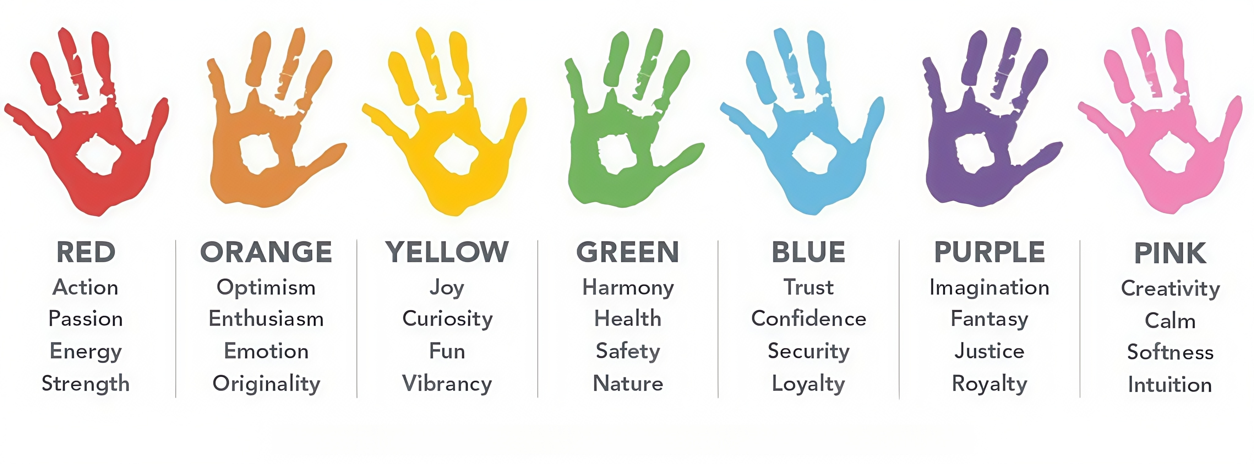
Color influences biological responses through the retino-hypothalamic tract, moderating heart rate, hormonal balance, and neural activity. Translating those effects into furniture design requires understanding five universal principles:
1. Warm vs. Cool Balance
Warm tones—yellow, orange, red—stimulate arousal, collaboration, and creative risk-taking. Cool tones—blue, green, turquoise—support sustained focus, calm, and error reduction. An optimized classroom blends both to transition between energetic group work and quiet individual tasks.
2. Saturation and Brightness
Mid-saturation hues (45-65% chroma) with medium brightness are ideal for desks and chairs, offering visual interest without overwhelming the senses. Hyper-saturated neon or overly muted pastels can cause glare or boredom, respectively.
3. Contrast for Visual Hierarchy
High-contrast color accents on desk edges, chair backs, or table legs guide spatial orientation and alleviate cognitive load during furniture rearrangement. Example: pairing a subdued sage green top with sunflower-yellow edges clarifies perimeters while keeping the main surface low-glare.
4. Cultural Neutrality and Inclusivity
Avoid color pairings associated with specific cultural signals (e.g., red/green holiday combinations) unless celebrating a deliberate theme. Neutral palettes foster inclusivity across diverse student populations.
5. Biophilic Resonance
Earth-inspired hues—forest green, sky blue, clay terracotta—reinforce a sense of natural connection, reducing stress and sharpening concentration in window-limited classrooms.

Table 1 – Color Effect Matrix
Hue | Psychological Effect | Ideal Furniture Application | Potential Pitfall |
Yellow (55-65% sat) | Boosts energy, sparks creativity | Chair backs, project tables | Overuse causes visual fatigue |
Orange (50% sat) | Encourages participation, warm social cues | Cafeteria stools, collaborative desks | High sat may elevate agitation |
Red (40-50% sat) | Increases alertness, short-term focus | Accent stripes on legs | Sustained exposure raises anxiety |
Blue (50-60% sat) | Enhances concentration, lowers pulse rate | Exam desks, computer stations | Deep navy can feel oppressive |
Green (45-55% sat) | Promotes calm, visual processing | Library carrels, reading corners | Dull olive can appear institutional |

Young learners benefit from warm, high-contrast palettes that nurture curiosity and sensory exploration. Furniture in butter-yellow or soft coral pairs well with accent edges in apple-green. Desks with multicolor leg caps double as shape and color identification tools.
Case Study 1 – Bright Beginnings Kindergarten
After switching from beige tables to two-tone yellow-green desks, teacher-led observations recorded a 22% increase in voluntary reading during free-choice sessions. Parents noted greater enthusiasm for school discussions at home.
Cognitive development shifts to structure and task persistence. Balanced palettes incorporating teal, sunflower, and cool gray ground energy while supporting longer attention spans.
Case Study 2 – Evergreen Elementary
Updating chair seats to teal mesh and frames to graphite powder coat reduced off-task behavior by 18% during math drills compared with previous primary-color plastic seats.
Pre-teens value identity and peer connection. Slightly desaturated hues such as muted mustard or dusty mauve modernize spaces without mimicking corporate aesthetics. Interchangeable desk panels let students vote on seasonal colors, fostering ownership.
Case Study 3 – Horizon Middle School
A modular desk system with swap-able color tiles allowed quarterly palette changes. Surveyed students reported feeling 30% more “in control” of their environment, correlating with a 12% rise in homework completion.
Teenage learners juggle intense study requirements with social stress. Cool, sophisticated schemes—graphite, indigo blue, sage—help manage anxiety and project maturity. Pops of electric lime or scarlet on stool footrests reinforce wayfinding in large labs.
Case Study 4 – Metro High STEAM Lab
Replacing old oak benches with indigo-top lab tables and lime footrest stools improved seat selection speed by 40%, shaving transition times between classes.
Table 2 – Age-Group Palette Guide
| Age Range | Primary Tones | Accent Tones | Typical Surface | Best Furniture Types |
3-7 | Warm yellow, coral | Apple green | Table surfaces | Rounded edges, low desks |
8-11 | Teal, sunflower | Cool gray | Chair seats | Stackable mesh chairs |
12-14 | Muted mustard | Dusty mauve | Desk panels | Modular desks |
15-18 | Indigo, sage | Electric lime | Lab benches | High-stool stations |

Classrooms require dual-function palettes for lecture focus and group activity. Use cool base tones (sky blue tops) to calm, with warm edge bands (tangerine) on collaborative tables to cue energy. Contrast aids visually impaired students.
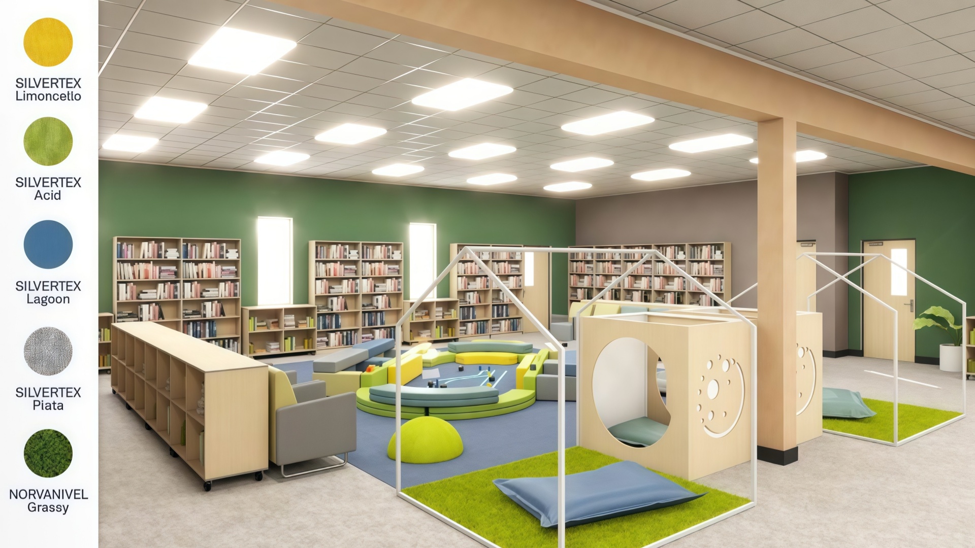
Soft greens and powder blues encourage prolonged reading. Shelving end-panels in deep teal reduce visual clutter, guiding attention to book spines.
High-energy environments thrive on vibrant saturation. Crimson chair backs against charcoal tabletops create dynamic contrast while hiding stains.
Warm neutrals—clay terracotta, buttercream—stimulate appetite and socialization. Seat tops in light gray enhance light reflection without glare.
Desaturated blues lower cortisol, supporting confidential conversations. Woodgrain desks with sage modesty panels soften the vibe without sacrificing professionalism.
Table 3 – Room-Color Performance Matrix
| Room Type | Base Color | Accent Color | Primary Outcome |
Classroom | Sky blue | Tangerine | Balance focus / collaboration |
Library | Powder blue | Deep teal | Extend reading endurance |
Makerspace | Charcoal | Crimson | Spark innovation, hide stains |
Cafeteria | Clay | Buttercream | Encourage social eating |
Counseling | Sage | Walnut | Foster calm, trust |
Case Study 5 – Lakeside Elementary Library
Switching shelving end panels to deep teal and reading nooks to powder blue increased average check-outs per student by 17% within one term.

Vibrant colors must endure daily wear, cleaning protocols, and UV exposure.
1. Powder-Coated Steel Frames
Retain color up to 10 years; resists chipping better than spray paint.
Best for chair legs and desk frames in high-traffic areas.
2. High-Pressure Laminate (HPL) Surfaces
Supports UV-stabilized dyes resistant to fading under fluorescent lighting.
Ideal for desktops and shelving.
3. Injection-Molded Polypropylene Seats
Full-penetration pigmentation ensures scratches do not reveal white subsurface.
Available in virtually unlimited color matches.
4. Water-Based Upholstery Dyes
For soft seating, choose solution-dyed polyester fabrics rated 100,000+ double rubs.
Table 4 – Durability Rating of Color Finishes
| Material | Color Longevity | Abrasion Resistance | Maintenance Level |
Powder-Coated Steel | 9/10 | 9/10 | Low |
High-Pressure Laminate | 8/10 | 8/10 | Low |
Polypropylene | 7/10 | 7/10 | Very Low |
Upholstery Fabric (SDP) | 6/10 | 8/10 | Medium |


Charterhouse Lagos | Education Project by Hongye Furniture
Implementing ideal colors for school furniture is a strategic process that integrates psychology, age-appropriate design, functional zoning, and long-lasting materials. Warm hues ignite creativity in younger students, balanced tones sustain focus in middle years, and sophisticated cool palettes support adolescents preparing for higher education. Pair those color frameworks with modular furniture, durable finishes, and thoughtful maintenance plans to future-proof your investment.
Final Recommendations:
Conduct a color audit to identify existing pain points in each learning space.
Map furniture color choices to developmental stages and room functions.
Prioritize mid-saturation, medium-brightness hues for main surfaces; use vivid accents sparingly.
Specify industrial-grade finishes—powder coat, HPL, solution-dyed fabrics—to preserve vibrancy.
Engage students and staff in pilot projects to refine palettes before full rollout.
Review color performance annually and refresh accent components every 3-4 years to maintain psychological impact.
1. How many colors should be used in a single classroom?
Limit primary furniture surfaces to one base color and one or two accent colors. Excessive variation can distract students and complicate future maintenance.
2. Are neutral tones ineffective for learning environments?
Neutral shades provide essential visual rest areas. Pair neutrals like light gray or warm taupe with strategic accent hues to prevent a sterile atmosphere.
3. How often should colored furniture be refreshed?
With high-quality finishes, main surfaces last 8-10 years. Replace accent components—edge banding, chair backs—every 3-4 years to sustain psychological benefits.
4. Do color preferences differ between genders?
While minor trends exist, educational design should prioritize function-based color psychology over stereotypical gender palettes to foster inclusivity.
5. Can I mix warm and cool tones in the same space?
Yes. Use cool tones for primary surfaces supporting concentration, and warm accents on collaborative zones to signal activity transitions.
6. Does lighting affect furniture color choice?
Absolutely. Test sample panels under actual classroom lighting to ensure hues remain accurate. Cooler LEDs complement warm furniture tones, while daylight favors balanced palettes.